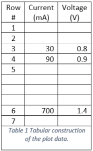
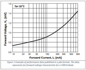
In the process of characterizing a physical device or process, the original performance specifications are published in a plot format such as illustrated in Figure 1. But suppose you need to have the data in a tabular format such as that of Table 1. How do you go about doing the conversion? The most obvious way is with a pen and paper where you will transcribe the data manually. With this approach you observe in the Figure 1 example that there are three easy to pick data pairs from just eyeballing the plot. These are easy to pick because the plot curve overlays the intersection of the two XY lines. These three data-pairs are at 30 mA at 0.8 Volts, 90 mA at 0.9 Volts, and 700 mA at 1.4 Volts. We can then enter these three data-pairs into a table as illustrated in Table 1.
In order to transcribe any other points some measure of interpolation will be required. Does it sound like this is going to get hard? Relax, we are going somewhere that will make it all very easy but first we need to understand the concept we are about to automate.
If transcribing these data-pairs by eyeball there will be much room for estimation. For example, consider the data-pair near 400 mA. The voltage at 400 mA is a little bit more than 1.2 V but how much? Is it 1.21 or maybe even 1.205? Or would we be better off looking for the current at 1.2 Volts? The current at 1.2 Volts will be a little bit less than 400 mA, but how much less?
There are some numerical techniques to serve as aids in this effort but one very useful application in this regard is the concept of a “scanned data” utility. With a scanned data utility we start with a bitmap image of the published plot (as shown in Figure 1), import it into the utility and then identify three corners and corresponding data-pairs for those three corners. The reader might be wondering about this time why three corners and not four. The nature of the plot necessitates that the plot is orthogonal. That is, any corner is a right angle or 90o.
Assume that two of our three corners are on the right-most end of the chart along the Y axis. In the example these corners represent the voltages at 10 mA. Therefore, at the bottom of the chart we have 0.6 Volts at 10 mA and at the top we have 1.6 Volts, also at 10 mA.
Is the reader beginning to see why it is three and not four corners that we have to nail down? It is because of duplication resulting from orthogonality.
Now consider the axis along the bottom of the chart, the X axis. At the left we have already identified the values so moving to its far right extreme we can identify the concluding current to complete the entire coordinate system—800 mA.
At this point the computer knows the entire grid of the chart and if we click on any point within the plot the computer is able to interpolate with extreme precision what the corresponding data-pair is for that point. Once a series of dots is placed which superimpose the published curve, the application is able to export a table.
In the next blog post we will look at one such example of a scanned data utility that is offered free on the web.